
United States Seasonal Outlook Flags Warmer Spring Trend for Florida, Texas, California and Georgia While Montana, North Dakota and Minnesota Lean Cooler
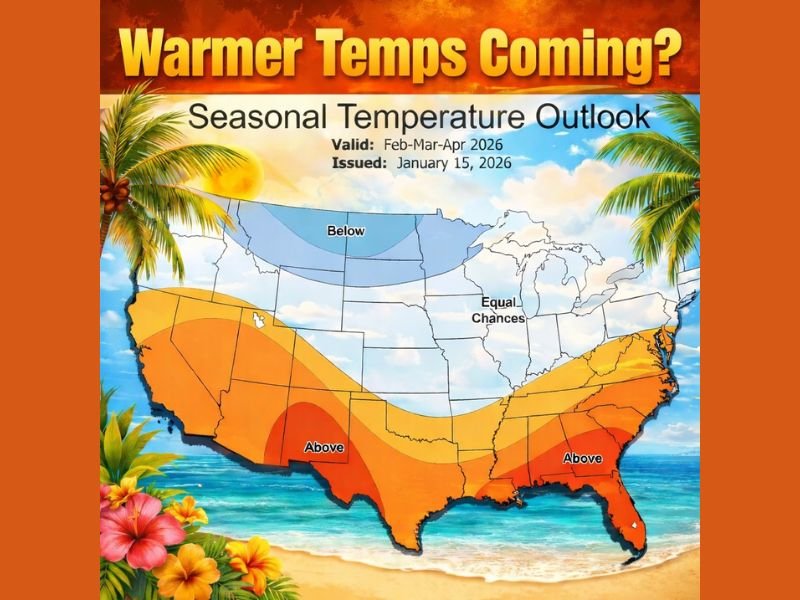
UNITED STATES — A long-range three-month temperature outlook for February–March–April 2026 suggests the country may split into two main regimes: higher odds of warmer-than-average temperatures across much of the southern United States, and a cooler-than-average tilt across parts of the northern tier, with a large middle zone labeled “equal chances.” The outlook shown is valid for Feb–Mar–Apr 2026 and was issued January 15, 2026, and the note on the graphic itself makes a key point: these seasonal outlooks sometimes verify and sometimes don’t, but they can still provide a useful big-picture signal.
What the Feb–Mar–Apr 2026 map is showing
The map is a seasonal temperature outlook, not a day-by-day forecast. It groups the U.S. into three broad categories:
- Above: areas where there are higher odds that average temperatures over the three months will trend warmer than normal
- Below: areas where there are higher odds that the three-month average will trend cooler than normal
- Equal Chances: areas where there’s no strong seasonal lean either warmer or cooler
That matters because “Above” does not mean every day is warm, and “Below” does not mean nonstop cold. It’s about the overall balance of the season compared to typical averages.
Where the map leans warmer across the South and Sun Belt
The strongest “warmer” signal on the map is aimed at the southern tier, including key parts of the Sun Belt and Southeast.
Based on the shaded “Above” region, the warmer-leaning zone covers large areas that include:
- California and the Desert Southwest (including Arizona and New Mexico)
- Texas, especially the southern portion
- The Gulf Coast region, extending eastward
- A significant share of the Southeast, including Florida, Georgia, Alabama, Mississippi, Louisiana, and portions of the Carolinas
In simple terms, the map’s message is that, over the Feb–Mar–Apr window, the South is more likely to stack up more “warm” days than “cool” days overall, even if periodic cold fronts still drop through.
Where the map leans cooler in the northern tier
The “Below” section is focused in the northern U.S., particularly across the Northern Plains and Upper Midwest corridor.
The cooler-leaning area includes parts of states such as:
- Montana
- North Dakota
- Minnesota (and nearby northern sections of the region)
This does not guarantee a harsh winter extension, but it signals that the northern tier could see a higher chance of cooler averages lingering into early spring compared with typical seasonal expectations.
What “Equal Chances” means for the middle of the country, including Illinois
A wide swath of the central and northern-central U.S. is labeled “Equal Chances.” On this type of map, that’s important: it means the data shown does not favor either a warmer-than-normal or cooler-than-normal outcome strongly enough to call it.
For readers in Illinois, including the Chicago suburbs, “Equal Chances” generally means spring temperature swings could go either way—periods of early warmth followed by setbacks, or a slower warm-up punctuated by mild stretches. In practice, it often matches what Midwest residents know well: spring can be a stop-and-start season.
Why these seasonal outlooks can be useful even when they’re not perfect
The map itself notes the reality: long-range outlooks sometimes verify and sometimes they don’t. That’s because seasonal patterns can shift, and smaller-scale weather events still drive the day-to-day reality.
But seasonal outlooks can still help with:
- Planning expectations (warmer-leaning South vs cooler-leaning North)
- Travel planning (knowing which regions might be more spring-like overall)
- Energy demand awareness (heating vs early cooling patterns in warmer zones)
- Agriculture and outdoor scheduling (broad timing signals, not precise dates)
The most accurate way to use a map like this is as a trend indicator, not a promise.
What to watch next as February approaches
If you’re tracking whether this pattern is holding, the next clues usually come from how the first half of February behaves:
- Does the South maintain repeated warm surges, or do cold snaps become more frequent?
- Does the northern tier keep reloading colder air, or does warmth break through more consistently?
- Does the “Equal Chances” zone start trending one direction based on persistent patterns?
Those answers typically become clearer as shorter-range forecasts take over.
For more national and regional weather trend coverage that impacts travel, seasonal planning, and Midwest temperature swings, keep following NapervilleLocal.com.

Naperville is a community with stories that deserve to be told — both the serious ones about safety and justice, and the lighter ones that capture our culture and daily life. I focus on covering crime reports and court updates while also highlighting the traditions, events, and social trends that shape who we are. Through my reporting, I want to give readers a fuller picture of Naperville — the challenges we face and the character that keeps our city strong.